1. Preliminary
1.1‘Budget Speeches Analysis’ is Ikigai Law’s project initiated to (i) identify trends in the word frequency[1] of different words in India’s budget speeches, and (ii) compare them against trends in India’s economic parameters. Essentially, this project attempts to apply simple analytical tools to detect patterns in budget speeches, which would otherwise not be explicitly visible to a reader. It also maps whether repeated reference to a given sector in the budget speeches translates to a tangible difference in the growth or promotion of the sectors. In this post, we will identify trends in the word frequency of the term ‘service’ and compare it against different economic indicators. This is the third post in the ‘Budget Speeches Analysis’ series. The second post can be found here.
2. Scope of analysis
2.1 This post analyses the word frequency of ‘service’ in India’s union and interim budget speeches. It maps the word frequency of ‘service’ against the net output of the services sectors in India. The time period for analysing services has been set from 2019 to the earliest year until which reliable data was found. All values used in this post are measured on an annual basis. All union and interim budget speeches can be found here. All data used for this project is sourced from the World Bank’s Open Data project and can be found here, here, here.
3. Data source
3.1 This project requires data to be available on an annual basis, summed up for all Indian sectors and over a long period of time for the analysis to be fruitful. India’s national data sources though meet the first two criteria, they do not provide data for a long period of time. The project hence relies on data provided by the World Bank’s Open Data project managed by the Development Data Group of the World Bank. The World Bank works closely with the international community such as the team at the United Nations, International Monetary Fund, regional banks, etc. to source its data.
4. Economic indicators[2] used in this post
4.1The World Bank’s Open Data project defines ‘services, value added’ to include “value added in wholesale and retail trade (including hotels and restaurants), transport, and government, financial, professional, and personal services such as education, health care, and real estate services. Also included are imputed bank service charges and import duties. Value added is the net output of a sector after adding up all outputs and subtracting intermediate inputs. It is calculated without making deductions for depreciation of fabricated assets or depletion and degradation of natural resources.” The origin of this economic indicator is the United Nations Development Programme’s Human Development Report, 2003. The value of services, value added has been measured at current USD.
The word frequency of ‘service’ is also compared against the annual growth (in percentage) in value added by services (“services, value added (annual % growth)”) and the percentage of gross domestic product (“GDP”) that the value added by services formed (“services, value added (% of GDP)”).
5. Results
The following graphs compare the trends in the word frequency of ‘service’ and the trends in services, value added (in current USD).
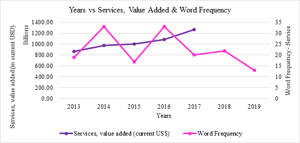
5.1 The trend in the word frequency of ‘service’ is compared to the trend in services, value added for each year over a period of five years (2013 – 2017) in the following graph. It is observed that the trends of both these variables[3] (word frequency of ‘service’ and services, value added (in current USD)) do not move in a synchronised manner.
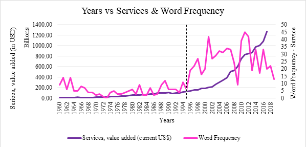
5.2 The trend in the word frequency of ‘service’ is compared to the trend in services, value added for each year over a period of fifty-eight years (1960 – 2017) in the following graph. Both of these variables appear to be moderately correlated. The Pearson correlation coefficient[4] is found to be 0.66 which indicates a moderate positive correlation. It is also observed that this correlation was particularly strong after 1995. Another interesting observation is that the word frequency of ‘service’ started fluctuating after 1995. The variance[5] of word count of ‘service’ from 1960 to 1995 is found to be 11.35 whereas the variance for word count of ‘service’ from 1996 to 2019 grew to 89.41. This implies that reference to the word ‘service’ was not very predictable after 1995, while in some years the absolute number of references grew compared to the previous year (for instance, between 1996 and 1997), in other years, the absolute number of references fell drastically (for instance, between 1998 and 1999).
The following graphs focus on comparing the trend in the word frequency of ‘service’ and the trend in services, value added (annual % growth).
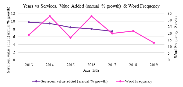
5.3 The trend in the word frequency of ‘service’ is compared to the trend in services, value added (annual % growth) for each year over a period of five years (2013 – 2017) in the following graph. It is observed that the trends of both these variables do not move in a synchronised manner. In fact, the percent growth in value added by services continuously declined over the five years despite fluctuation word frequency of ‘service’.
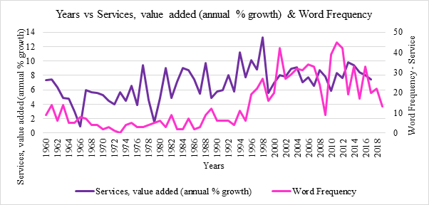
5.4 The trend in the word frequency of ‘service’ is compared to the trend in services, value added (annual % growth) for each year over a period of fifty-eight years (1960 – 2017) in the following graph. Both of these variables appear to be weakly correlated. The Pearson correlation coefficient is found to be 0.41 which indicates a weak positive correlation. This may imply that the two variables are likely independent of each other and have minimal impact on each other over a long period of time.
The following graphs compare the trend in the word frequency of ‘service’ and the trend in services, value added (% of GDP).
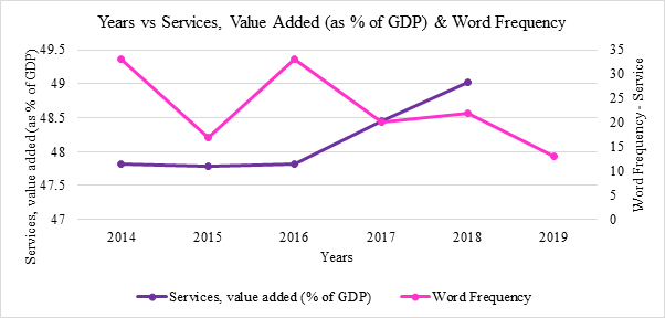
5.5 The trend in the word frequency of ‘service’ is compared to the trend in services, value added (% of GDP) for each year over a period of five years (2014 – 2018) in the following graph. It is observed that the trends in both these variables do not appear to move in a synchronised manner. Both variables do not show coordination in the movement of their values.
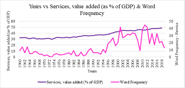
5.6 The trend in the word frequency of ‘service’ is compared to the trend in services, value added (% of GDP) for each year over a period of fifty-nine years (1960 – 2018) in the following graph. Although the previous chart did not show signs of correlations, here the word frequency of ‘service’ and services, value added (% of GDP) are strongly correlated. The Pearson correlation coefficient is found to be 0.81 which indicates a strong positive correlation. This implies that the two variables may be related to each other since. This shows that over a longer period of time, an increase in the absolute number of references to the word ‘service’ translates into growth in the value added by services as a percentage of the GDP of India.
5.7 A scatterplot[6] of the word count of ‘service’ and services, value added (as % of GDP) is shown in the following graph. It shows that services, value added (% of GDP) tends to move upward as the absolute number of references to the word ‘service’ increases year by year, pointing at a possible linear relationship between the two variables. Each dot on the scatterplot represents the value of variables when mapped on their respective axes.
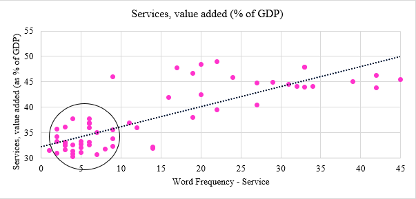
We built a linear regression model[7] to determine if a cause-action relationship can be drawn between the two variables, where the word frequency is set as the independent variable (a variable that can be controlled and changed to observe its effect on a dependent variable) while, services, value added (% of GDP) is the dependent variable (a variable that is dependent on the independent variable and responds to a change in the value of the independent variable). The regression line is also plotted on the scatterplot above. It is found that only one variable, the word frequency of ‘service’, is insufficient[8] to establish any direct cause-action relationship with service, value added (% of GDP). It can hence be said that despite word frequency of ‘service’ being correlated to services, value added (% of GDP), it is insufficient to establish a valid cause-action relationship between the two values.
The following graph compares the trends in the word frequency of ‘service’ in the interim budget speeches and final union budget speeches for the same year.
5.8 It is observed that word frequency of ‘service’ in interim budgets tends to be lower than that of in most final budget speeches.
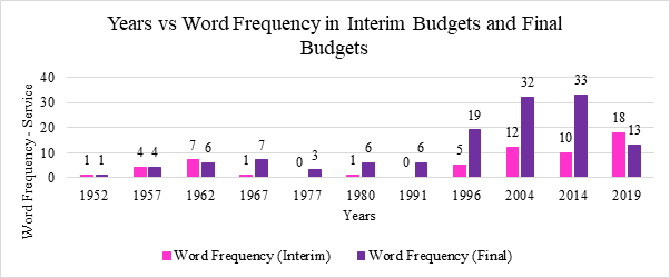
5.9 The average number of times ‘service’ was used in union budget speeches from 1960 to 2019 hovers around 14 whereas for all interim budget this value hovers around 5.
6. Conclusion
This analysis tells us that there is no direct relationship between the word frequency of ‘service’ mentioned in budget speeches and the actual value added by services in India. Though we do observe that the value added by services and word frequency of ‘service’ has significantly grown after 1995, the changes in the two values may be only slightly dependent on each other.
(Authored by Vihang Jumle, Associate, Ikigai Law with inputs from Tuhina Joshi, Policy Associate; and Anirudh Rastogi, Founder at Ikigai Law.)
[1] For the purposes of this project, the term ‘word frequency’ has been used to denote the number of times a word occurs in a particular text.
[2] An economic indicator is a statistic that measures economic activity, such as the unemployment rate, the level of industrial production, or the level of output, etc.
[3] A variable is an indicator which is being compared on the graph. Here, word frequency and services, value added are referred to as variables.
[4] A Pearson correlation coefficient of 1 indicates a strong positive correlation whereas -1 indicates a strong negative correlation.
[5] Variance measures how far a set of numbers are spread out from their average. For instance, for a set of three data points let us say 1, 1, 1, the average is 1 and all the values are also 1, hence the variance is 0.
[6] Scatterplot is a chart that uses dots to represent the values obtained from two variables.
[7] A regression model is used to determine a cause-action relationship between variables. Our regression model gave us the following values – Coefficient (word frequency) estimate = 0.3945, Standard error = 0.0374, p-value = 5.16e-15; Coefficient (intercept) estimate = 32.228, Standard error = 0.7055, p-value = <2e-16; Residual standard error = 3.583; Adjusted R-squared = 0.6552.
[8] A residual is the difference between the estimated value and the real sample value. The residuals of the regression model here are not normally distributed (p-value for Shapiro-Wilk test is 0.001386, Null hypothesis: Sample comes from a normally distributed data) which implies that expected errors of the model change at different levels of the dependent variable. This also implies that the independent variable’s accuracy changes at different levels of the dependent variable. Thus, making the model not reliable for making accurate predictions.